
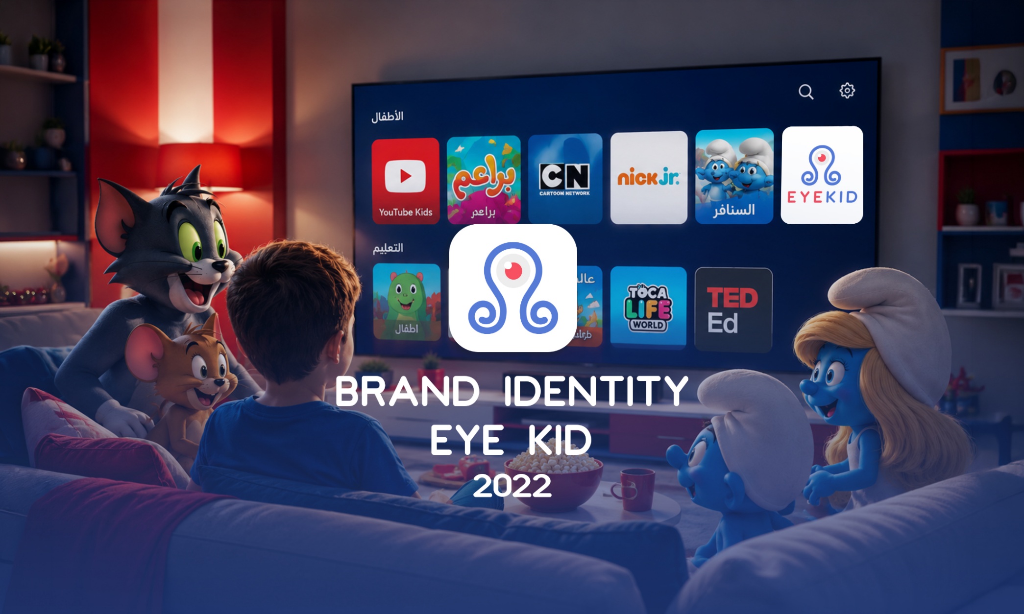
EyeKid is a parental control application designed to help families create a safer digital environment for children. The app enables parents to monitor, manage, and filter online content, giving them greater confidence in their children's digital activities while encouraging healthy and responsible screen habits. The visual identity was designed to communicate trust, safety, and simplicity through a modern and approachable brand system. A vibrant palette of red, blue, and white was selected to balance security with a child-friendly personality, creating a recognizable identity across digital platforms. __________________________________________________________________________ Role: Brand Identity Designer Responsible for designing the complete visual identity, including: Logo Design Brand Strategy Color Palette Typography Selection Visual Identity System Brand Guidelines Marketing Assets Digital Brand Applications _________________________________________________________________________ Challenge Create a visual identity that balances child-friendly aesthetics with a strong sense of trust and digital security, while appealing to parents as the primary decision-makers. _____________________________________________________________________________ Solution The identity was built around a clean, approachable visual language that reflects protection, guidance, and simplicity. Rounded shapes, vibrant colors, and modern typography were combined to create a recognizable and flexible brand across digital platforms. __________________________________________________________________________